
Global Dashboard Strategy
Rackspace Global Dashboard team needed a product strategy reset ahead of the 2020 roadmap. I joined the team shortly after a major team overhaul to help establish a new user-centered direction for this underperforming core customer experience.
My Role: Lead UX Designer
Collaborators: PM, Engineering Lead, Sr. Engineer, Sr. Visual Designer
The Need
What began as a potent product idea fell flat in reality. The challenges of enterprise data availability and team misalignment caused a number of central, value-driving features to be cut from the MVP launch. Research and analytics findings clearly indicated that customers did not yet find value in the “single-pane-of-glass“ they were given. One research participant even remarked, “It’s useless, so I usually blow right past it.“ Ouch.
Project Kick-off
Star Trek Workshops
To kick-off the effort, I facilitated a remote workshop. The goal of a Star Trek canvas is to align the new team on shared Vision, Mission, and Purpose. With much of the team relatively new to the project, it was helpful to define the “What” and “Why” of the project together.
The outputs of the Star Trek Canvas are Vision, Mission, and Purpose statements that can be read together for a full picture of the initiative (much like the intro voiceover for a Star Trek episode, hence the name).
The workshop led us into the next workstream, which defines key objectives, success metrics the team will be accountable to, and capabilities needed to execute. We completed these asynchronously.
Drivers section of the Star Trek Canvas
Metrics to track section of the Star Trek Canvas
Discovery
Research synthesis
Many research efforts had already been devoted to the Global Dashboard, including usability studies, contextual inquiry, competitive analysis, heuristic analysis, participatory design study, and user interviews. I had designed and led a few of them myself, previously. I synthesized the findings related to the dashboard and collected them into a research synthesis report.
Research Synthesis Report slide

Research Synthesis Report slide
Expert walkthrough of key workflows
We didn’t have much analytics data and rather than run another expensive user observation study to get a baseline experience score of the current dashboard and identify areas of opportunity, I conducted an expert walkthrough. I selected one of our personas, Amelia-Rose the Infrastructure Manager, and documented how she would accomplish three workflows that are central to her Jobs to be Done using the Global Dashboard.
I mapped the journey, noted pain-points, gave each step a sentiment score (which calculated an overall experience grade) and made prioritized recommendations for improvement.
Expert walkthrough step slide slide
Expert walkthrough journey score
As a praxis note, while the sentiment score is useful in capturing whether the experience meets user expectation, it doesn’t adequately capture the user’s effort expense, which I have a hunch is also directly tied to cognitive wear, brand opinion, and ultimately churn. Perhaps more so. Next time, I will include an effort coefficient—maybe something similar to Gartner’s Customer Experience Index equation.
Design + Iterate + Test
Ideation
Once we knew what information domains were desired, I led a series of small group sketching sessions with designers from across product areas to explore data presentation options within each prioritized domain. I carried on a few promising directions forward through a few iterations and developed medium fidelity proofs of concept for them. Ultimately, I collaborated with a Sr. Visual Designer and another Design Lead to prototype the most promising directions for testing.
data presentation option concepts
Customers demonstrated multiple data scoping needs. A pattern emerged that certain needs aligned with our persona roles (huzzah for quality personas!). So sketched ideas around three categories of data presentation widgets with the intent to validate our concepts with customers. The three categories are:
Low-level, high detail data visualizations
Mid-level, medium detail lists
High-level, low detail item counts
Testing
We pulled out a few key concepts to validate with customers. Our research questions focused on testing the validity of the data presentation option directions and validating our the prioritized execution order of widgets.
We brought in nine participants segmented to evenly represent our critical personas, each with footprints that contain multiple accounts. It was a tricky recruit, but we ended up with great customer data and feedback!
Defining the Strategy
2022 Dashboard Vision
The major blocker for success for the Global Dashboard is centered around data availability (lack of APIs). To help the many teams that will need to move in lock-step rally around a shared vision for the future customer experience, I developed a 2022 vision document.
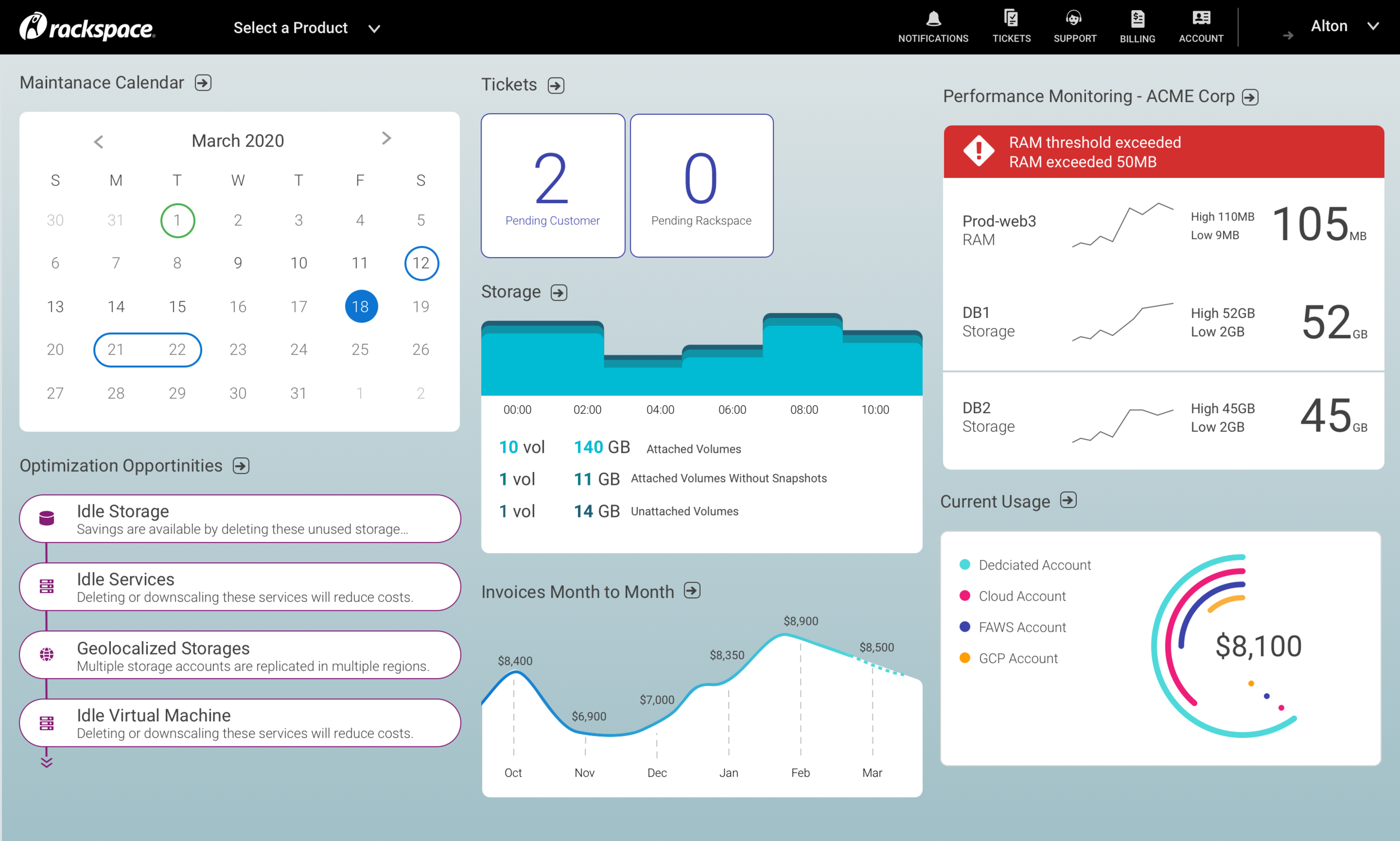
I selected two mission-critical personas and collaborated with a Sr. Visual Designer to build out concepts for the dashboard each persona needs. We pushed the visual language enough to be inspiring without being a total departure from the existing design language. We also adhered to the fundamental widget structure that existed, with only three minor tweaks: removing the “card“ visual metaphor, Turning up the dial on the color use to communicate meaning, and added an 8px corner radius to help each widget’s content cohere visually in the absence of the “card“ background.
Global Dashboard 2022 Vision concept for Alton Baker, the Chief Systems Architect
Proposed Acceptance Criteria
Dashboard Acceptance Criteria
As we worked on the roadmap, our backlog of product teams requesting to add a widget to the Global Dashboard continued to grow. A number of these requests didn’t align with the Vision, Mission or Purpose of the Global Dashboard. To better manage the backlog, I drafted acceptance criteria that defined the data experience requirements that all widgets must meet to be made available on the dashboard. I find this kind of criteria to be a powerful tool in adhering to strategy.
Analytics plan spreadsheet
Analytics Plan
The dashboard had yet to be instrumented, and the team struggled to understand how it was actually being used and made major product decisions without much data to inform them. I collaborated with the Engineering Lead, another Design Lead and our Research team to develop a google analytics measurement plan that included the Dashboard and our Global Navigation properties to ensure clean, ethical, and usable data.
Phased Roadmap recommendations
Getting to 2022 is a long road, so I helped the PM develop a phased approach to incrementally improve the Dashboard experience on the way to our 2022 vision that prioritized high value widgets and data display options.
Phase 1
Update the pipeline to allow more engineers to develop widgets (removes the Dashboard dev team from list of blockers)
Finalize customization feature to allow customers to add and remove widgets
Advocate for Device Health APIs
Advocate for Optimizations APIs
Advocate for Usage APIs
Phase 2
Build Device Health widget (count, list, and data vis display options)
Add count and visualization display options to Tickets, Notifications, and Billing widgets
Build Optimizations widget Add Maintenance Calendar widget (display options TBD)
Build Rackspace System Status widget
Advocate for Activity Log APIs
Advocate for usage APIs
Phase 3
Build Usage Widget
Build Activity Log widget (display options TBD)
Build Patching widget